

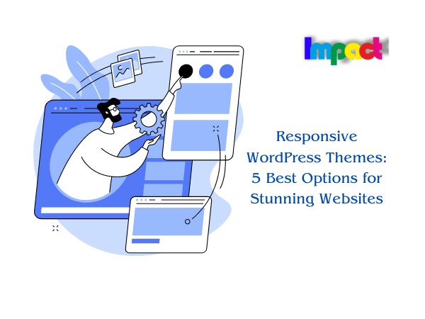
Responsive WordPress themes have become increasingly popular in recent years, as more and more people access websites from their mobile devices. These themes are designed to adapt to different screen sizes and resolutions, ensuring that your website looks great on any device.

In this article, we will explore the benefits of using a responsive WordPress theme, and provide a list of some of the best options available on the market today. We will also discuss the key features
BUY A .COM DOMAIN AT JUST $5.98**
Table of Contents
Benefits of Using a Responsive WordPress Theme:
The benefits of using a responsive WordPress theme are numerous. Firstly, a responsive theme ensures that your website looks great on any device, regardless of its screen size or resolution. This is important because more than half of all internet traffic comes from mobile devices, and this number is only set to increase in the coming years.
Another benefit of using a responsive WordPress theme is that it can help to improve your website’s SEO. Google has stated that mobile-friendliness is a ranking factor, which means that having a responsive website can help to boost your search engine rankings.
Furthermore, using a responsive WordPress theme can help to improve user experience. Visitors to your website are more likely to stay and engage with your content if they can easily navigate and interact with your site on their mobile devices.
The 10 Best Premium WordPress Themes for Your Website
Also Read:
Key Features of Responsive WordPress Themes
When choosing a responsive WordPress theme, there are several key features to look for. Firstly, make sure that the theme is fully responsive and will adapt to different screen sizes and resolutions.
Secondly, look for a theme that is optimized for speed. A fast-loading website is important for both user experience and SEO, so make sure that the theme you choose is lightweight and optimized for speed.
Thirdly, consider the customization options available with the theme. A good responsive WordPress theme should offer a range of customization options, allowing you to tailor the design of your website to your specific needs.
Finally, make sure that the theme is compatible with the latest version of WordPress and is regularly updated to ensure compatibility with new versions of WordPress and any new devices that may be released.
Best Responsive WordPress Themes
There are many great responsive WordPress themes available on the market today. Here are some of the best options:
Divi:
Divi is a popular and highly customizable WordPress theme that comes with a built-in drag-and-drop page builder, making it easy to design and customize your website. It is fully responsive, optimized for speed, and offers a wide range of design options, including pre-made templates and layouts. Divi also offers advanced features such as A/B testing, split testing, and conversion rate optimization.


Astra:
Astra theme is a lightweight and fast-loading WordPress theme that is fully responsive and highly customizable. It offers a range of pre-made templates and layouts, making it easy to design your website. Astra is optimized for speed and offers advanced features such as custom fonts, header options, and page builder integrations.
Avada:
Avada theme is a popular and versatile WordPress theme that is fully responsive and comes with a range of customization options. It offers a drag-and-drop page builder, making it easy to create custom layouts and designs. Avada also offers advanced features such as custom widgets, shortcodes, and WooCommerce integration.
OceanWP:
OceanWP is a lightweight and fast-loading WordPress theme that is fully responsive and highly customizable. It offers a range of pre-made templates and layouts, making it easy to design your website. OceanWP is optimized for speed and offers advanced features such as custom widgets, social media integration, and WooCommerce compatibility.
Hestia:
Hestia is a modern and stylish WordPress theme that is fully responsive and optimized for speed. It offers a range of pre-made templates and layouts, making it easy to design your website. Hestia also offers advanced features such as custom widgets, social media integration, and WooCommerce compatibility.
Optimizing Your Website for Mobile Devices
In addition to using a responsive WordPress theme, there are several other steps you can take to optimize your website for mobile devices. Firstly, make sure that your website’s content is easily readable on small screens. This means using a legible font size and avoiding large blocks of text.
Secondly, make sure that your website’s navigation is easy to use on mobile devices. This may mean using a hamburger menu or other mobile-specific navigation options.
Finally, make sure that your website’s images and other media are optimized for mobile devices. This means using compressed images and ensuring that videos and other media are playable on mobile devices.
Conclusion
Choosing a responsive WordPress theme is crucial for ensuring that your website is accessible and user-friendly for all visitors, regardless of their device or screen size. With the increasing use of mobile devices for browsing the web, it’s essential to have a website that can adapt to different screen sizes and resolutions.
There are many high-quality responsive WordPress themes available, each with its unique features and benefits. When selecting a theme, consider your website’s purpose, design preferences, and functionality requirements.
Remember to choose a theme that is regularly updated, well-supported, and compatible with the latest WordPress version. A responsive theme can help improve your website’s search engine rankings, user experience, and overall success.
With the right responsive WordPress theme, you can ensure that your website looks great and functions flawlessly on any device. So, take the time to research and choose the best option for your needs, and watch your website thrive!